|
| |||||||||||||||||||||||||||||||||||||||||||||||||||||||||||||||||||||
|
Geeks of Doom is proudly powered by WordPress. Students of the Unusual™ comic cover used with permission of 3BoysProductions The Mercuri Bros.™ comic cover used with permission of Prodigal Son Press Geeks of Doom is designed and maintained by our geeky webmaster All original content copyright ©2005-2023 Geeks of Doom All external content copyright of its respective owner, except where noted |
This website is licensed under a Creative Commons License. |
| About | Privacy Policy | Contact |


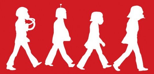
I like the idea a lot more than the execution. I’m not really feeling the red/white color scheme, and it’s a little too hard to distinguish the silhouettes. I want it to be a little less abstract… Neither Abbey Road nor Star Wars was abstract, so flattening them into a two-color abstract adds a third element that sort of overtakes the two elements that the artist is mashing up. It makes it look lazy to me.
I’d probably like it more if it had another color or two and maybe more image clues like the lines of the crosswalk underneath their feet, or the perspective lines of the street in the background. Something to make it a little more obviously Abbey Road and something else to make the Star Wars characters pop more clearly. I think less abstract would make it cooler… yeah, just a little more concrete.
Comment by Lyle — February 5, 2011 @ 10:53 am