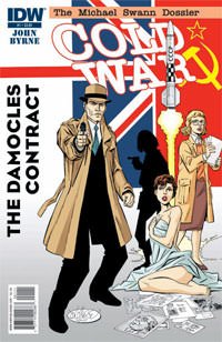
 Cold War #1
Created, written & drawn by John Byrne
Colors by Rhonda Pattison
Letters by Neil Uyetake
Covers by John Byrne
IDW Publishing
Release Date: October 19th, 2011
Cover Price: $3.99
WARNING!!!! Do NOT buy this comic unless you want to have FUN! I’m not sure just what I was expecting from this comic, but it went far beyond any and all expectations that I had for it. In spades.
Cold War #1 opens with an incredible 11-page sequence that is really fascinating. The great thing about this book is that, while it’s clearly a spy genre, James Bond-type of comic, it doesn’t beat you over the head with it. It’s not a direct homage to the genre, like Crossgen’s Kiss Kiss Bang Bang, but it has the spirit of the genre without blatantly ripping off James Bond trademarks like gadgets, scandalously named women, and witty one liners. It’s almost an undercover spy book. A covert undercover spy book. Good Lord, I feel like I’m in the “in-famous” scene in The Three Amigos movie.
As far as the art goes, it’s John Byrne. You know what you’re getting and there’s really not any artistic surprises or reinvention of his style. Just straight-up John Byrne art. And it fits the comic really well.
I can’t recommend this book highly enough. It’s got a solid, enjoyable story. Equal amounts of action, intrigue and mystery. Seriously, PICK UP THIS COMIC! You will not regret it. Cheers to IDW and John Byrne for putting out something awesome and different.


Byrne’s artwork is so rushed these days..what happened? Why is his old stuff (pre-Next Men) so much better? Is it age? I hear his eyesight is going bad..poor guy.
His writing was always Byrne’s biggest failing but now his art is falling apart too. A real shame.
Too bad Marvel and DC have boycotted him due to his toxic personality.
Comment by AlCook — October 19, 2011 @ 9:46 am
John Byrne liked your review! http://bit.ly/r0iPlj
What cover did you get? My LCS has both the regular and propaganda cover waiting for me and I’ll have to decide when I go in later. I think based on what I have seen online, my favorite is the regular cover.
Comment by JohnByrneSaidWhat? — October 19, 2011 @ 1:51 pm
I’ve always enjoyed John Byrne’s artwork a great deal, until ‘Spider-man: Chapter One’ came out. Did he have a stroke or something aropund this time? Since Chapter One it looks all so bad. Like he’s not pencilling anymore, instead is inking straight onto the page.
Look at the hands, the feet, the way people stand around, like they’re wearing a diaper.
I don’t know what is wrong with the guy.
Comment by Oli — October 20, 2011 @ 9:36 am