
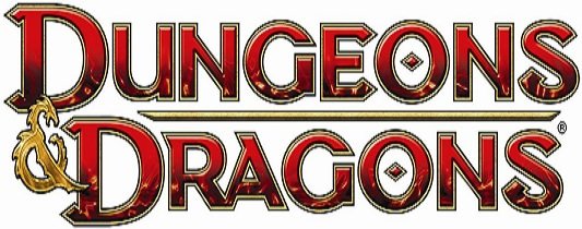
As I mentioned last week, there’s a lot going on in the world of Dungeons & Dragons this summer. Not the least of which is their new logo! And though I only briefly mentioned it in my article, more information has been made available that you might find interesting.
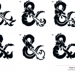
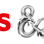
The new logo is cool; I like the way each letter has a spike (or two) coming off of it. Makes it seem more diabolical, I suppose. But the big news rests on the little symbol between the words, the ampersand. It is this small piece of the logo that has the largest impact. Polarizing fans the world over, this logogram was designed by Glitschka Studios at the behest of Hasbro. But what they created was just the start; Hasbro altered the ampersand by giving it more depth through a more artistic rendering. The final addition is the change of coloration, turning a flat single colored item into a chromed multidimensional version.
Continue reading for more and to see some images.
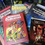
Now, keep in mind that the changes that occurred are seemingly minor as the D&D logo has long had a dragon embedded in its ampersand. That little trick has been around since the early days; it’s on my Basic and Expert Dungeons & Dragons guides. And while Glitschka Studios revamped it, I don’t see the big deal with it. I’m not a fan of the chromed look but I cannot help but wonder if they did that in reference to this summer’s new releases involving Tiamat. She is known as The Chromatic Dragon, after all. Though I could be reading too much into it, honestly. It could all be a coincidence, right?
But make up your own mind as to whether or not you like it. Check out the gallery of pictures below, and feel free to share your opinion — we’d love to hear from you! And if you did miss out on all the other news regarding Dungeons & Dragons, again, you check out the article here.
Images
[Source: Brand New]








No Comments »
No comments yet.
RSS feed for comments on this post. TrackBack URL
Leave a comment