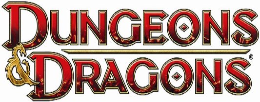
As I mentioned last week, there’s a lot going on in the world of Dungeons & Dragons this summer. Not the least of which is their new logo! And though I only briefly mentioned it in my article, more information has been made available that you might find interesting.
The new logo is cool; I like the way each letter has a spike (or two) coming off of it. Makes it seem more diabolical, I suppose. But the big news rests on the little symbol between the words, the ampersand. It is this small piece of the logo that has the largest impact. Polarizing fans the world over, this logogram was designed by Glitschka Studios at the behest of Hasbro. But what they created was just the start; Hasbro altered the ampersand by giving it more depth through a more artistic rendering. The final addition is the change of coloration, turning a flat single colored item into a chromed multidimensional version.
Continue reading for more and to see some images.
...continue reading »


