
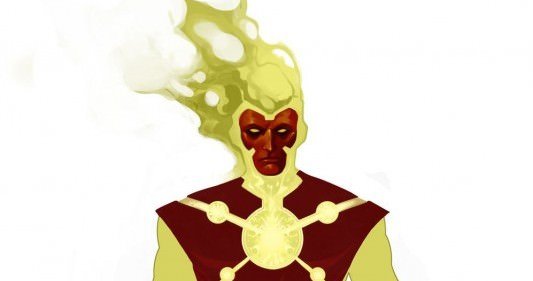
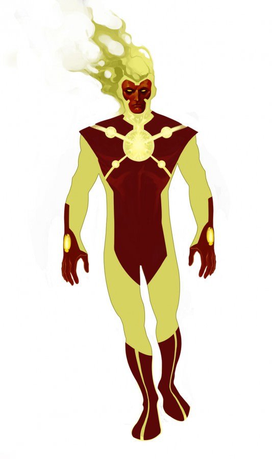
Artist Andy Trabbold took a shot at doing a redesign of Firestorm, the DC Comics superhero, and it is totally awesome.
For those of you that don’t follow Project Rooftop, it’s a place that showcases fan art redesigns of popular characters from all of pop culture. They’ve had contests on redesigning Wonder Woman, Invincible, and many other characters in the past, and while there aren’t any big contests going on right now, there a couple of gems here and there. And the Andy Trabbold redesign of Firestorm is one of those gems.
To me, Firestorm has never looked right, and that’s especially the case with the current New 52 series Fury of Firestorm. In fact, in my opinion DC is plagued with some over the top, busy designs that are just not pleasing to a modern comic art fan, so when I saw the stripped down and reversed color scheme of Trabbloid’s Firestorm, I was more than just a little excited. Firestorm has always been a character that I really enjoyed but the nuclear powered hero was always missing something. And apparently, to me, he was always missing a simplistic, streamlined design. Yes, it seems that Trabbloid’s design is something that I’ve wanted to see for a long time.
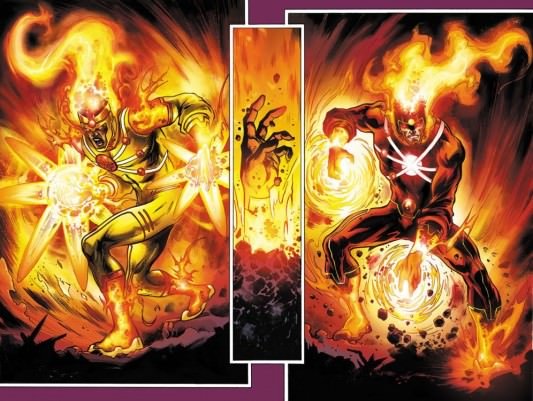
Just take a look at the design of the current Firestorm by Yildiray Cinar against Trabbloid’s design for a second. First, here’s Cinar’s from The Fury of Firestorm:

Now, there’s no taking away from Cinar’s talent as his art is simply gorgeous. And it’s also worth noting that he did not redesign Firestorm for DC’s “New 52” look. The New 52 redesigns were in the hands of the more than capable Cully Hamner and Jim Lee. But there’s also no arguing that this design is at the very least busy and cluttered.
Now take a look at the full design from Andy Trabbold:

You see what I mean? The simplistic and streamlined approach to Firestorm really works better for the character in my opinion. I’d love to see this style applied to characters like Firestorm, Darkseid and many others that we’ve seen recently with armor on top of armor.
I understand that this is my opinion and that others may not share it, but I can’t help but love this design. In this situation, less is definitely more. But to check out other fan art redesigns, make sure to follow Project: Rooftop, and if you love this redesign as much as I do, make sure to check out Trabbloid’s art blog.
[Source: Project: Rooftop]




My first impression is that I’m looking at some discarded variant of an Iron Man costume. I guess what I dislike the most is the head. The fire looks a little too flat and the face a little too 3D when it should probably be the other way around. Fire is a living, breathing monster and I expect it to be reaching out in all directions. Here, it looks like Firestorm is wearing an exploded cheesehead. I like where this design might have been going but really don’t like where it ended up.
Comment by PAUL — December 24, 2011 @ 12:34 pm