Postal #2
Written by Bryan Hill and Matt Hawkins
Illustrated by Isaac Goodhart
Colored by Betsy Gonia
Lettered by Troy Peteri
Covers by Linda Sejic, Isaac Goodhart, and Betsy Gonia
Top Cow Productions, Inc.
Release Date: March 11, 2015
Cover Price: $3.99
In Eden, a town populated by former criminals looking for a second chance at life, events tend to unfold quickly and the past seems to literally be coming back to haunt the leaders of the community. Written by Bryan Hill and Matt Hawkins, with art from Isaac Goodhart and colors from Betsy Gonia, Postal #2 amps up the drama and sheds a monumental light on the history of Eden.
Normally when I read crime thrillers, the story is paced steadily, with new information offered in pieces, as to not give too much away all at once; however, this is not the case with Postal. Hawkins and Hill do not slow down; in fact, they’re picking up speed quickly and crafting quite the enticing tale! By the end of the first issue of Postal, I knew a few things about the town of Eden and was privy to the beginnings of a dangerous mystery. By the end of the second issue, everything I desired to know had been answered, new storylines have advanced, and I’ve been thrust deeper into the vivid, complex lives of the characters. This is storytelling at its finest.
I would be remiss if I didn’t briefly mention the protagonist and narrator, Mark: a young, postal service worker with Asperger’s Syndrome. An unusual, yet intriguing choice for a lead character of any series, Hawkins and Hill have created a prime candidate to tell this story, as Mark is able to use his differences to solve the multiple conundrums facing the small town — and the path that Mark follows takes a surprising turn by the end of the second issue.
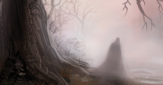
Every character introduced has a secret worth hiding, and Goodhart’s illustrations and Gonia’s colors harmonize in a way that allows you to feel the darkness and paranoia behind the characters’ metaphorical masks. Bleak colors set to memorable visual imagery, Postal is in good hands with this artistic team.
Postal #2 is proof that a comic book series can be enthralling from the start. Hawkins and Hill have a big story to tell, and it would be criminal for you not to check it out.


No Comments »
No comments yet.
RSS feed for comments on this post. TrackBack URL
Leave a comment